
Manage color and proof for print
This guide covers the steps that prepare artwork for a printer: the color settings and profiles, soft proofing on screen, overprinting, the ink plates, spot colors, transparency flattening and trim marks.
Choose color settings and profiles
Section titled “Choose color settings and profiles”The color settings choose the RGB and CMYK working spaces that VectorCraft converts colors through. They apply to every open document.
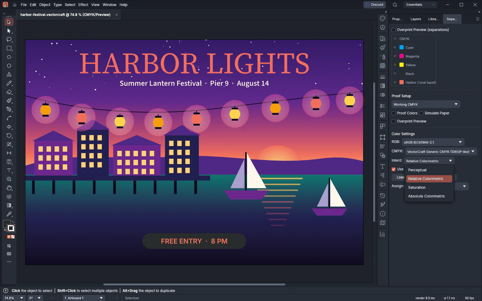
- Choose Edit → Color Settings… (Ctrl+Shift+K, or Cmd+Shift+K on macOS). The Separations Preview panel opens, and its Color Settings section holds the settings.
- Under RGB, pick the RGB working space.
- Under CMYK, pick the CMYK working space.
- Under Intent, pick how colors convert between spaces: Perceptual, Relative Colorimetric, Saturation or Absolute Colorimetric.
- Leave Use Black Point Compensation on, or turn it off.
| Setting | Built-in choices | Default |
|---|---|---|
| RGB | sRGB IEC61966-2.1, Wide Gamut RGB (1998 primaries), Display P3, ProPhoto RGB | sRGB IEC61966-2.1 |
| CMYK | VectorCraft Generic CMYK (SWOP-like), Device CMYK (uncalibrated) | VectorCraft Generic CMYK (SWOP-like) |
| Intent | Perceptual, Relative Colorimetric, Saturation, Absolute Colorimetric | Relative Colorimetric |
| Use Black Point Compensation | On, off | On |
To use the profile your print shop sends, press Load Profile… and pick the .icc or .icm file. The file can be up to 32 MB. VectorCraft keeps a copy in the Color Profiles folder next to its preferences and loads it again each time it starts. The profile then appears in the RGB or CMYK list.
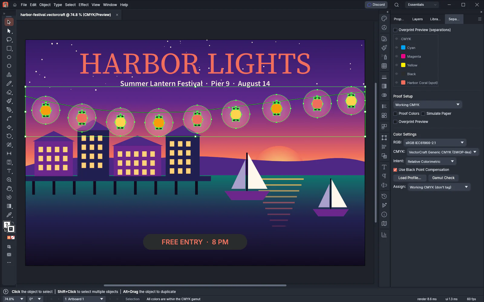
To check whether the colors in a document can be printed, press Gamut Check. It checks the selected objects, or the whole document when nothing is selected. The status bar shows how many colors are out of the CMYK gamut, or “All colors are within the CMYK gamut.”
Assign a profile to one document
Section titled “Assign a profile to one document”- Open the document and choose Edit → Assign Profile…. The Separations Preview panel opens.
- In the Color Settings section, pick a CMYK profile under Assign. Working CMYK (don’t tag) removes the tag.
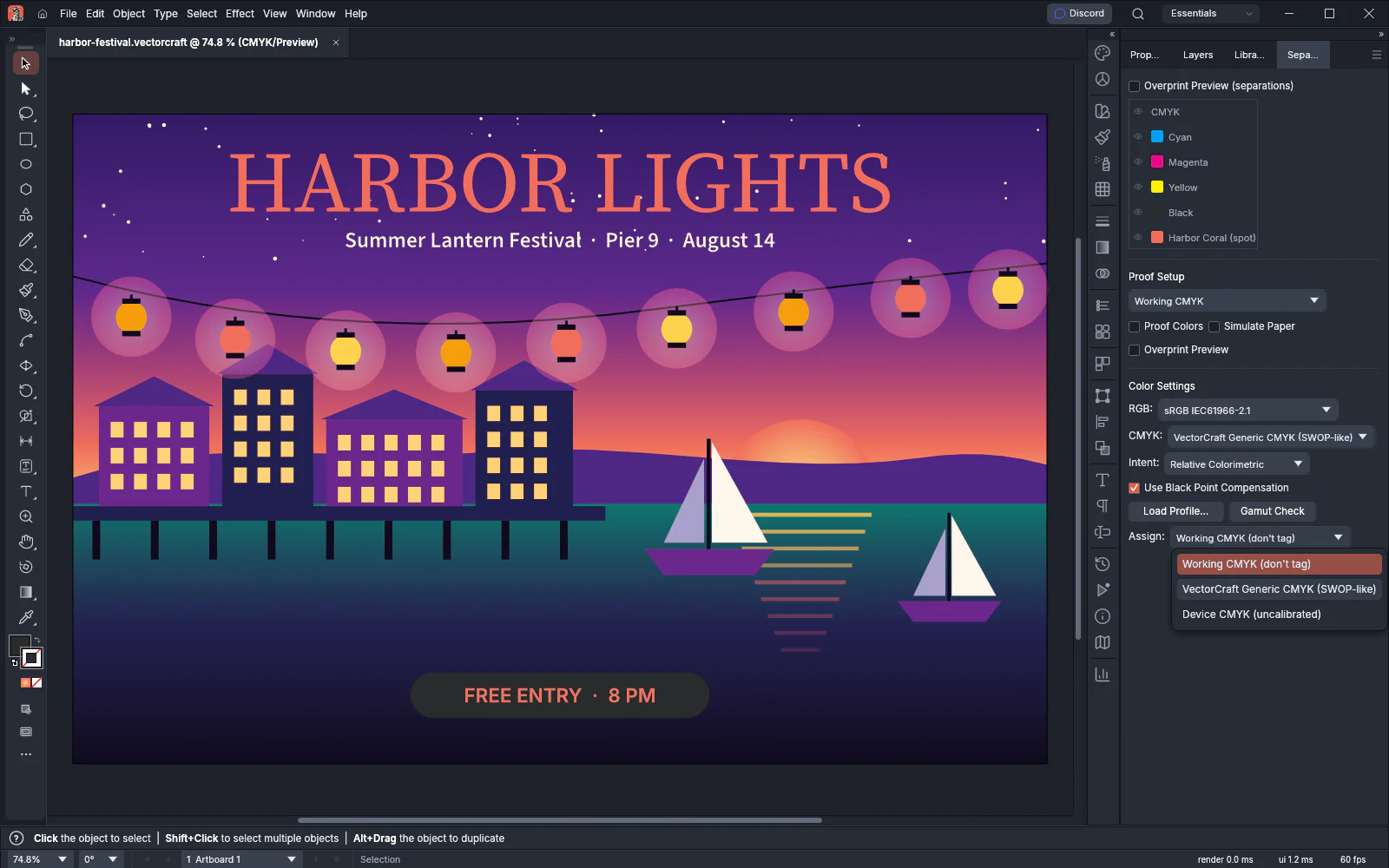
Assigning a profile keeps the color numbers of the art as they are. Only the way the colors display and convert changes. The assigned profile also becomes the CMYK working space.
Preview colors for another device
Section titled “Preview colors for another device”Proof Colors shows on screen how the art will look on another device or to a viewer with color blindness. The document itself does not change.
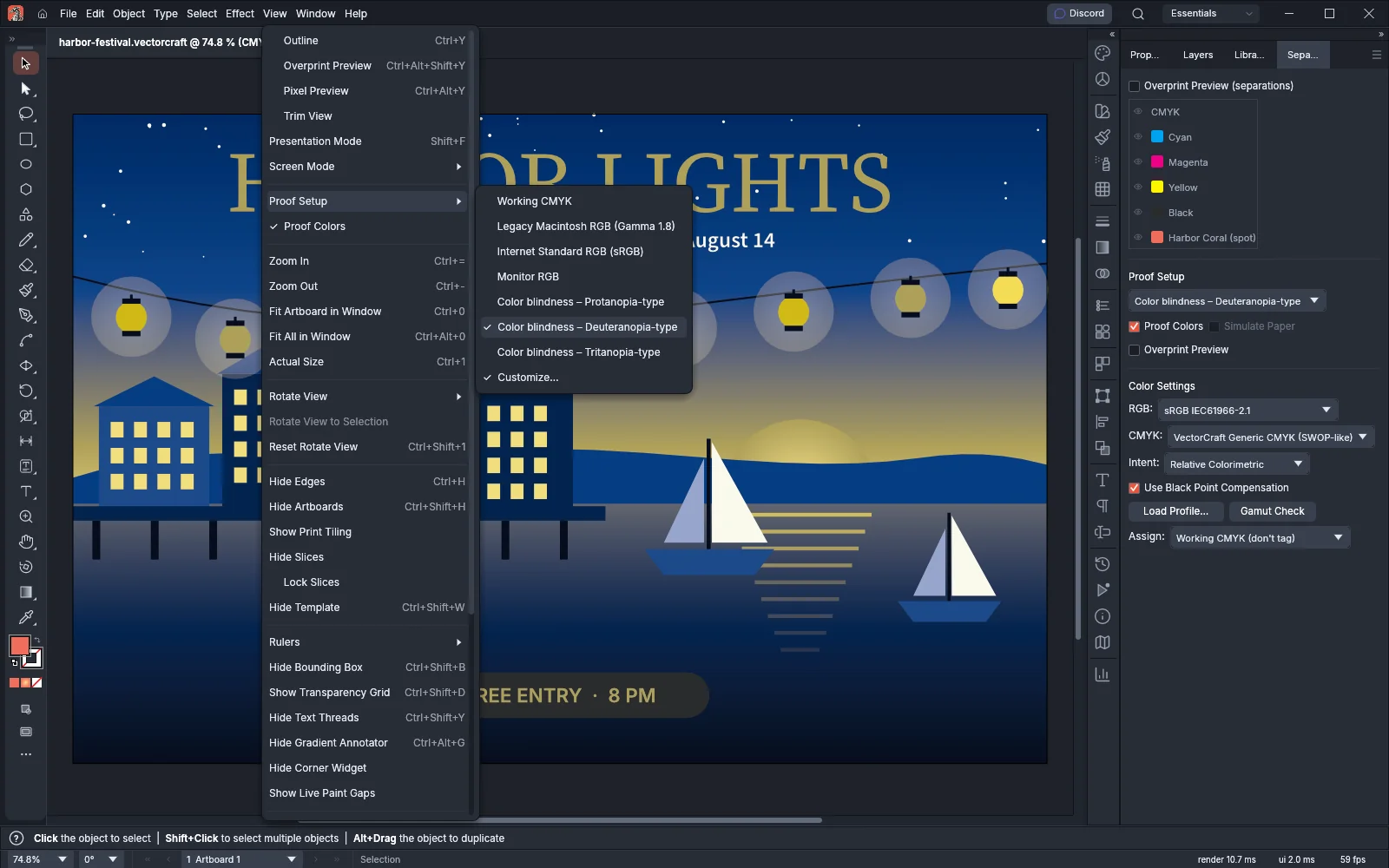
- Choose View → Proof Setup and pick a target from the following table. Picking a target also turns on Proof Colors.
- To turn the proof off or on again, choose View → Proof Colors.
- To change the target from a panel, choose View → Proof Setup → Customize…. The Separations Preview panel opens with a Proof Setup section that holds the target list, Proof Colors, Simulate Paper and Overprint Preview.
| Target | What the proof shows |
|---|---|
| Working CMYK | The colors printed with the CMYK working space |
| Legacy Macintosh RGB (Gamma 1.8) | The colors on an older Mac display with a gamma of 1.8 |
| Internet Standard RGB (sRGB) | The colors on a standard sRGB display |
| Monitor RGB | The colors on your own monitor |
| Color blindness – Protanopia-type | The colors as a viewer with protanopia sees them |
| Color blindness – Deuteranopia-type | The colors as a viewer with deuteranopia sees them |
| Color blindness – Tritanopia-type | The colors as a viewer with tritanopia sees them |
Simulate Paper is available only for a CMYK target.
Check how inks overprint
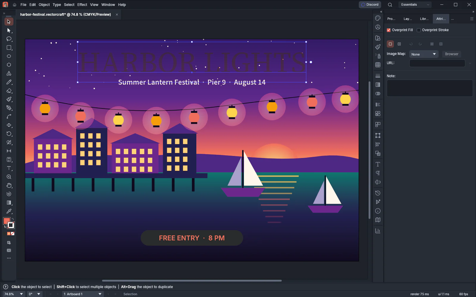
Section titled “Check how inks overprint”By default, an object knocks out the inks under it, so only its own ink prints there. An object set to overprint prints on top of the inks below it, and the inks mix. On screen, overprinting shows only while Overprint Preview is on.
- Choose View → Overprint Preview (Ctrl+Alt+Shift+Y, or Cmd+Option+Shift+Y on macOS).
- Select the objects that should overprint.
- Choose Window → Attributes.
- Turn on Overprint Fill, Overprint Stroke or both.
Overprint black
Section titled “Overprint black”Overprint Black finds the black fills and strokes in the selection and sets them to overprint.
- Select the art. In a group, the command changes the objects inside it. In type, it changes the characters.
- Choose Edit → Edit Colors → Overprint Black….
- Set the options from the following table and press OK.
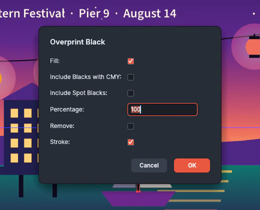
| Option | What it does | Default |
|---|---|---|
| Fill | Changes black fills | On |
| Stroke | Changes black strokes | On |
| Percentage | The lowest black (K) value that counts as black | 100 |
| Include Blacks with CMY | Also counts blacks that contain cyan, magenta or yellow | Off |
| Include Spot Blacks | Also counts blacks that use a spot swatch | Off |
| Remove | Turns overprint off for the blacks it finds, instead of on | Off |
Without Include Blacks with CMY, a color counts as black only when it has no cyan, magenta or yellow. A gradient counts as black when every stop is black.
Preview each ink with Separations Preview
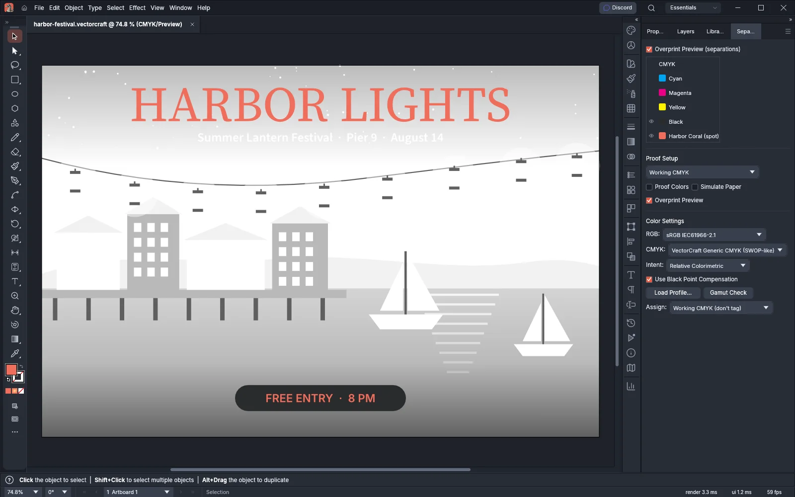
Section titled “Preview each ink with Separations Preview”Separations Preview shows the art one ink plate at a time: cyan, magenta, yellow, black and each spot color.
- Choose Window → Separations Preview.
- Turn on Overprint Preview (separations) at the top of the panel.
- Click the eye next to a plate to hide or show it. Alt-click (Option-click on macOS) an eye to show only that plate.
- To show every plate again, click the eye on the CMYK row, or choose Show All Plates from the panel menu.
When only one plate shows, the canvas draws that ink’s coverage in shades of gray. Spot plates appear at the end of the list with “(spot)” after their name.
Work with spot colors
Section titled “Work with spot colors”A spot color prints with its own premixed ink on its own plate, instead of being built from cyan, magenta, yellow and black.
- In the Swatches panel, press New Swatch, or double-click a solid color swatch to open Swatch Options.
- Set Color Type to Spot Color.
- Type a Swatch Name. The name becomes the plate name in Separations Preview and in printed separations.
- Pick the color and press OK.
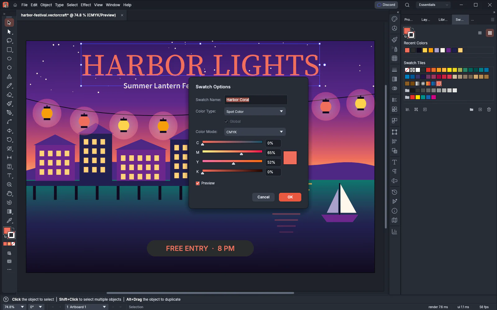
Ctrl-click (Cmd-click on macOS) New Swatch to open the dialog with Spot Color already chosen.
A spot color is always global, so Global is checked and grayed out. Changing the swatch changes every object that uses it. Only solid colors can be spot colors.
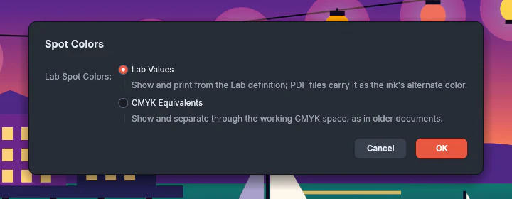
Spot colors defined in Lab values can display and separate in two ways. Choose Spot Colors… from the Swatches panel menu and pick an option under Lab Spot Colors:
- Lab Values shows and prints the color from its Lab definition. PDF files carry the Lab definition as the ink’s alternate color. This is the default.
- CMYK Equivalents shows and separates the color through the CMYK working space, as older documents did.
To print spot colors with the process inks instead of their own plates, go to the Output section of the Print dialog, set Mode to Separations and turn on Convert All Spot Colors to Process. Print your artwork covers that section.
Flatten transparency for printing
Section titled “Flatten transparency for printing”Flattening turns the transparent parts of the selection into opaque vector shapes and images. Use it before you send art to a printer or a file format that does not support transparency.
- Select the objects to flatten. The command is available only with a selection.
- Choose Object → Flatten Transparency….
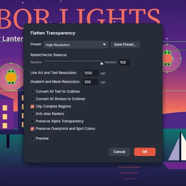
- Pick a Preset: High Resolution, Medium Resolution, Low Resolution or a preset you saved. The dialog opens on Medium Resolution.
- Adjust the options from the following table. When the options no longer match the preset, the preset list shows [Custom].
- Turn on Preview to see the result on the canvas. Preview is off when the dialog opens.
- Press OK. You can undo the flattening in one step.
To keep the options for later, press Save Preset…, type a Name and press Save.
| Option | What it does | Range |
|---|---|---|
| Raster/Vector Balance | At 0 (Rasters), all flattened art becomes images. At 100 (Vectors), everything that can stay vector stays vector. Between the two, complex areas become images. | 0 to 100 |
| Line Art and Text Resolution | The resolution of the parts that become images | 1 to 2400 ppi |
| Gradient and Mesh Resolution | The resolution of image areas that only gradients and meshes reach | 1 to 2400 ppi |
| Convert All Text to Outlines | Outlines all type, including type that is not transparent | On, off |
| Convert All Strokes to Outlines | Outlines all strokes, including strokes that are not transparent | On, off |
| Clip Complex Regions | Clips each image area to the outline of its region instead of a rectangle | On, off |
| Anti-alias Rasters | Smooths the edges of the image areas | On, off |
| Preserve Alpha Transparency | Keeps the art’s own transparency instead of placing it over white | On, off |
| Preserve Overprints and Spot Colors | Keeps spot colors, process colors and overprint where an area shows one paint | On, off |
| Preset | Balance | Line art and text | Gradient and mesh | Clip Complex Regions | Anti-alias Rasters |
|---|---|---|---|---|---|
| High Resolution | 100 | 1200 ppi | 300 ppi | On | Off |
| Medium Resolution | 75 | 300 ppi | 300 ppi | Off | On |
| Low Resolution | 75 | 300 ppi | 150 ppi | Off | On |
All three presets leave both outline options and Preserve Alpha Transparency off, and Preserve Overprints and Spot Colors on.
Manage flattener presets
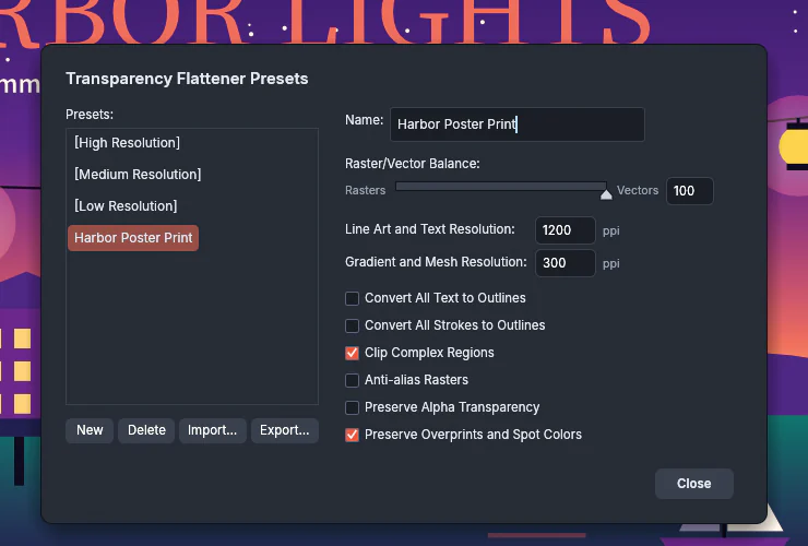
Section titled “Manage flattener presets”- Choose Edit → Transparency Flattener Presets…. The list shows the built-in presets in brackets, followed by your saved presets.
- Select a preset to see its name and options.
- Use the buttons under the list:
- New makes an editable copy of the selected preset.
- Delete removes a saved preset.
- Import… loads presets from a
.vcflattenerfile. - Export… saves the selected preset to a file.
- Edit the name and options of a saved preset beside the list. Each change is saved as you make it.
- Press Close.
The built-in presets cannot be changed.
Preview what flattening changes
Section titled “Preview what flattening changes”The Flattener Preview panel shows which parts of the document flattening would change, highlighted in red over a gray preview.
- Choose Window → Flattener Preview.
- In the list next to Refresh, pick what to highlight. The following table lists the choices.
- Set Overprints to Preserve, Simulate or Discard, and pick a Preset. To change single options, choose Show Options from the panel menu.
- Press Refresh to preview the document as it is now. When the document or the settings change, the panel shows “Changed since the last Refresh.”
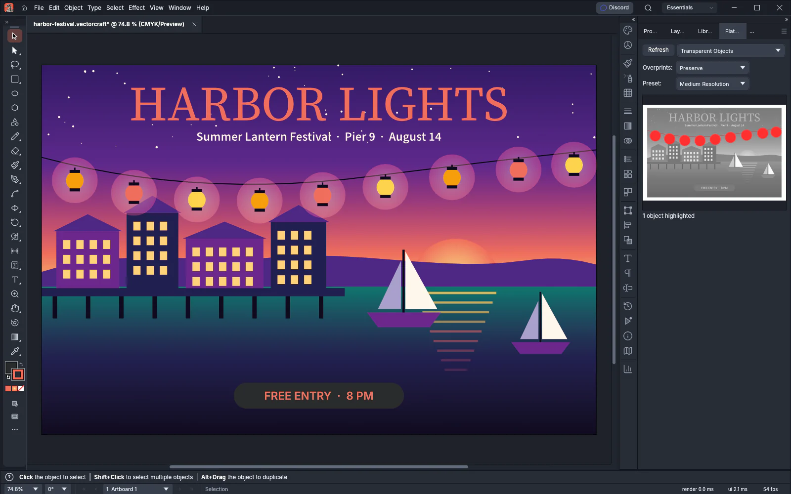
Click the preview to zoom in, Alt-click (Option-click on macOS) to zoom out, drag to pan, and double-click to fit. While a highlight is chosen, the panel shows how many objects or areas it highlights.
| Highlight | What turns red |
|---|---|
| None (Color Preview) | Nothing. The preview shows the art in color. |
| Rasterized Complex Regions | Areas that become images because they are too complex |
| Transparent Objects | Objects that use transparency |
| All Affected Objects | Every object that flattening changes |
| Expanded Patterns | Patterns that are expanded |
| Outlined Strokes | Strokes that become filled outlines |
| Outlined Text | Type that becomes outlines |
| All Rasterized Regions | Every area that becomes an image |
Add trim marks and check the trimmed page
Section titled “Add trim marks and check the trimmed page”Trim marks show the printer where to cut the page.
- To mark every artboard, deselect everything. To mark one piece of art, select it.
- Choose Object → Create Trim Marks.
VectorCraft draws one group of marks for each artboard, or one group around the selection, and you can undo them in one step. The marks are 0.3 pt lines in the [Registration] color, which prints on every plate. Roman marks start 9 pt from the edge and are 18 pt long.
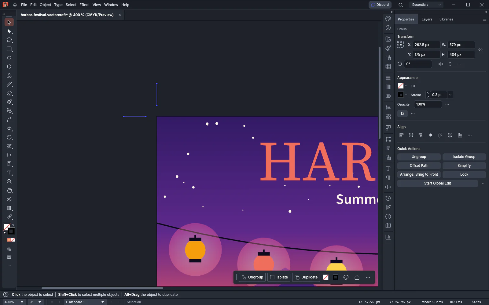
To draw Japanese marks instead, turn on Use Japanese Crop Marks in Edit → Preferences… → General (Ctrl+K) on Windows and Linux, and in VectorCraft → Settings → General… (Cmd+K) on macOS. Japanese marks add double lines at the trim and bleed edges, and center marks.
To see the page as it will look after trimming, choose View → Trim View. VectorCraft hides everything outside the artboards. Choose View → Trim View again to show it.